Tuesday 17 September 2013

Boffin Brainchild

As an illustrator it's a real thrill to see the fruits of your labour. To see the finished product of whatever it was that you helped out with. You'd think that common courtesy would mean that copies of books or leaflets or posters would be sent out to those responsible for its creation but unfortunately, in my experience this is pretty rare.

But this just makes the occasions when you are given the final product all the more exciting and special. Wow, you can actually show your nearest and dearest the proof of your illustrative success! The thrill of actually holding something physical is still better than looking at a screen.

And so to last week when a package thumped through my letterbox. Jill Jennings, author of Boffin Brainchild had emailed the day before asking if I had moved in the months since we had last corresponded. Having replied that I hadn't Royal Mail stepped up to plate and delivered the paperback in less than 24 hours! Good work lads!

Anyway, when I opened the parcel I was bowled over. It looks so good! And with the endorsement from Michael Morpurgo blazoned on the front is the icing on the cake. 

It's a great read!


It's out on 26th September 2013.

Front cover with cool sticker


Back cover

Proof to Mother
Original cover image


Wednesday 24 July 2013

Enid Blyton goes URBAN!

July is always a month when I reflect back on the work that I've completed in the last year. It's probably because this is when I need to submit a spread or two for my agent, showcasing my best work from the last year for their catalogue. Some years this dilemma of choosing appropriately brilliant work to show off my skills is easy and other years it's not so obvious. 

It's a good opportunity to think what direction I'd like my illustration  work to go in and produce some portfolio pieces to reflect this. The work commissioned through my agent is predominantly for educational publishers producing text books. This is great and the work can be fun but I always try to push the boundaries a little in my folio pieces.

After watching "Attack the Block" and "Sket" recently, I thought it would be fun to design some characters that work like the "Famous Five" by Enid Blyton but with a modern edge. Instead of being middle class kids having adventures in sun kissed meadows of Sussex or similar why not design them as kids living on an imaginary estate in London or Birmingham dealing with more gritty and urban predicaments. Why does everything have to be sanitized and brimming with sugary falsities? Why can't characters come from the rougher spectrum in children's literature?

Anyway, I got to work and created these characters and cover mockup. I'm pretty pleased with them and took the opportunity to use some of my own wardrobe to dress them, not the pink puffer tho!


Below are two versions of the poster/book cover for this imaginary product. I used photo filters, something I rarely do to give it more of a gritty feel. Not sure which one I prefer.


Monday 29 April 2013

Comics of my youth

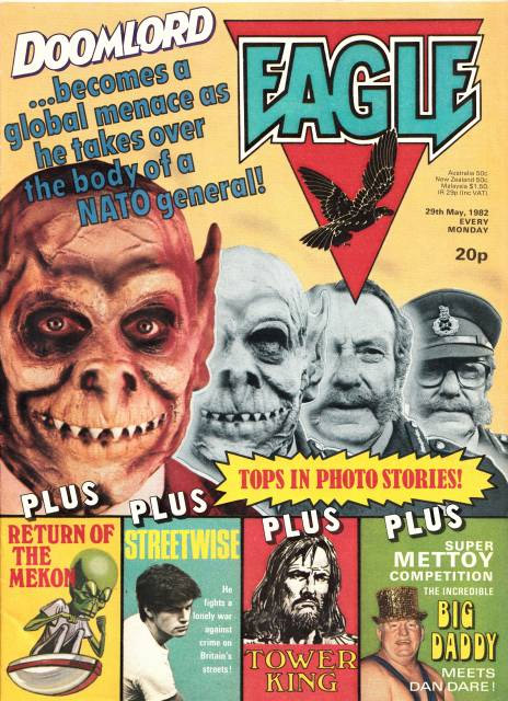
Being a child in the 1980s was great if you were a boy and loved comic books! This was a great time for home grown British publications. Sadly, something that cannot be said today.

The Eagle was relaunched in 1982, introducing Dan Dare, the Mekon and Doomlord to an eager new generation. This was also the year that I started reading 2000Ad!


When I wasn't absorbing these great comics I was out cruising the neighborhood on my Rayleigh "Grifter". This awesome bike was my beloved transport to the surrounding villages and woods where Star Wars, Clash of the Titans (original!) and Dr Who (especially the Cybermen in "Earthshock") were endlessly played out.


Anyway, as this is an illustration blog I thought I'd have a go at some of my favourite characters starting with some 2000AD ones.

Judge Dredd

Rogue Trooper


Joe Pineapples

Wednesday 10 April 2013

Modernising Educational Course Books

A few years ago I was commissioned by Oxford University Press to help illustrate an updated version of the series "English Time".

I was lucky enough to be hired as the main illustrator for Student Books 3 and 4.

To date, this was the biggest commission of my career. It was a fabulous job and I dived in wholeheartedly. The work load and deadlines were tough but here was a mammoth project for me to get my teeth into!

I loved it!

It was an interesting brief because I was required to take the original illustrations and modernize them. The characters and compositions were to keep their original integrity, this was the challenge and also the thrill.

It took me a few laboured attempts to doggedly copy the originals from scratch before I thought of solution to the compositional problem. 

I had to recreate these images quickly so I embarked on a method that was to prove very effective. First I would take the reference file of the original illustration blow it up to A3, save it into grey scale mode, print it out on two pieces of A4 and trace the basic shapes of the characters using the light box my Dad made for me twenty years ago. 

And viola

I now had the basic composition that I could then draw on top of. This technique was only used for the large, highly detailed images. I didn't need this technique for the smaller strip style artworks.

Here are some examples of original artwork and my new interpretations of them.


Old

New


Old


New


Old


New


Old


New


Old


New


Old


New
All images copyright to Oxford University Press

Monday 1 April 2013

Getting started

Hi

Welcome to my illustration blog.


So far 2013 has been extremely varied work wise, so for my very first post I thought I'd show you some of the commissions I've had since New Year.

Variety is the spice of life, after all!
  
For an extensive look at older work I have set up two permanent galleries, links to these are at the top of the page.


 Book Cover Design

This is a book cover for a novel called "Boffin Brainchild" by Jill Jennings available on amazon soon.

I had great fun working on this and was really pleased with how it turned out. 

I especially enjoyed painting the Yorkshire style houses in the background. Here's a look at them without the characters getting in the way.


 -----------------------------------------------------------------------------------------------------------------------------------

Christmas Recycling Cartoon


For Christmas 2012 I was commissioned by South Cambridgeshire District Council to produce a full page cartoon for their magazine.

This was a great job, dealing with the excesses of Christmas.


This is how it looked in the magazine.


I am a cartoonist at heart so whenever I get a chance to work in a more humourous fashion I relish in it.

Ok , so technically this was commissioned before New Year but I didn't get the magazine from my Mum until a few weeks ago so I'm slipping this one in.

-----------------------------------------------------------------------------------------------------------------------------------

Night Club Flyer

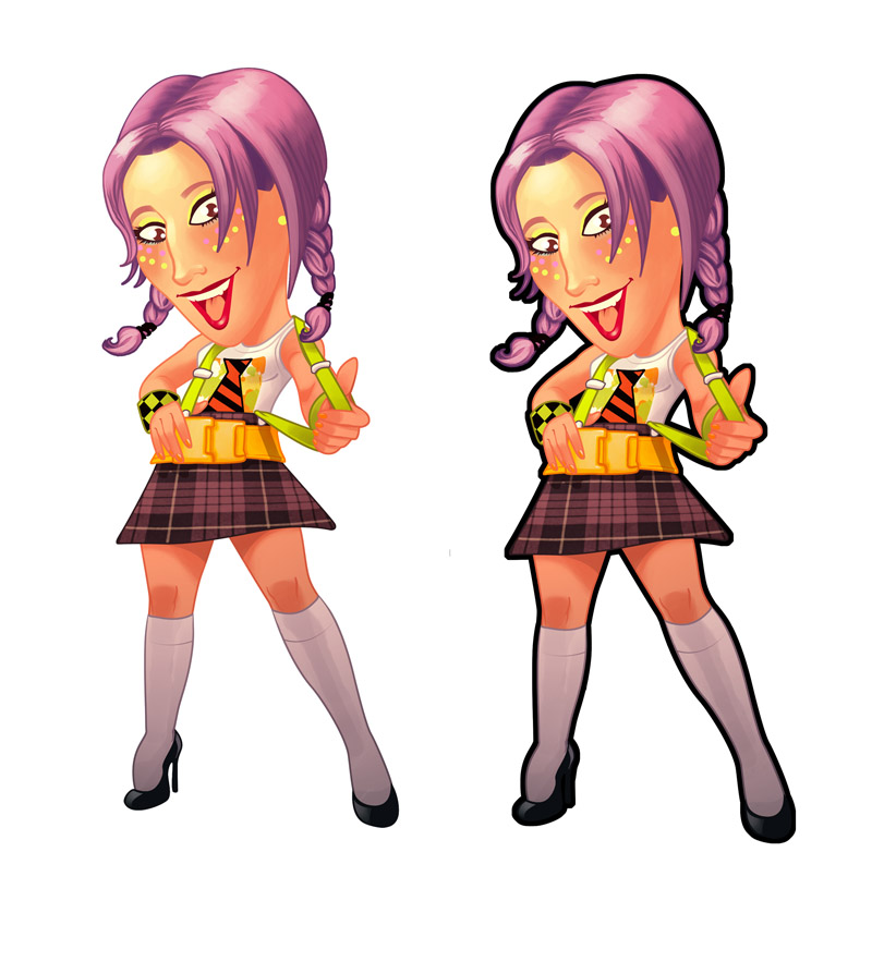
This next one is a cartoon of the DJ, Lisa Pin-up for the promotions company "More-on-the-Door".

This image was part of a flyer design for a School Disco event.


Here is the original sketch.

--------------------------------------------------------------------------------------------------------------

Fresh Prince T-Shirt Design

This was a Tee shirt design for "Logos-for-Polos".

Only eight colours could be used because of the printing process.

I don't do a lot of caricatures but I do enjoy them when I get a chance.


Here is the image without the colours.


--------------------------------------------------------------------------------------------------------------


 Diagram Poster

This image was commissioned by the company "Safe-T Supplies Ltd".

The brief was to show their company transporting cargo containers and palettes from mainland China to Britain and the E.U in a fun, graphical way.


--------------------------------------------------------------------------------------------------------------

Educational Editorial Work

These images were part of a set of illustrations commissioned by Collins for an educational book series for the Egyptian market.


--------------------------------------------------------------------------------------------------------------

Sample Piece

This was a sample piece for a new educational book series.


--------------------------------------------------------------------------------------------------------------

 Book Illustration

These following images were all commissioned by the "Educational Company of Ireland".


A pretty varied workload.

-------------------------------------------------------------------------------------------------------------